Interior designer Robert Kime manages to somehow bring together the past and the present and to combine them into these amazing spaces that are magnificent in a very unique way. In this case it’s as if an old historical bedroom has been cleaned up and brought into the modern world. The bed is obviously the centerpiece here but there’s a lot more to take in and discover throughout the entire room. 


 Lots of people including us are in love with Victorian homes, specifically with how grand they all and with all the details that set each little thing apart. You can expect a Victorian-style bedroom to have an eye-catching bed with a massive frame and a lots of decorative details on the frame. Another staple of Victorian interior design is the dark color palette. Check out this beautiful bedroom designed by Michelle Dirkse to see how these elements can be translated into a modern space.
Favorite bedroom with different styles
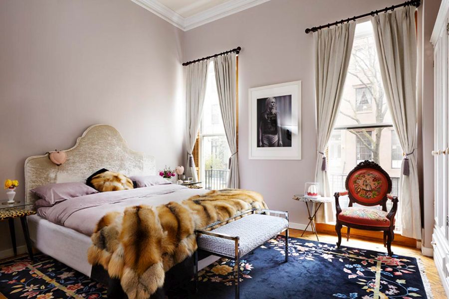
An eclectic bedroom with vintage vibes


A modern Victorian bedroom


Cheerful colors and patterns
Neutrals usually work best for guest bedrooms because they’re more versatile than other colors. It can be a good idea to avoid adding too many personal touches to this space although that shouldn’t mean an austere design without any details or character. This stylish guest bedroom designed by Michael Del Piero is a great example to follow.

Simple and elegant with a hint of luxury

When renovating or remodeling a bedroom it’s easy to be tempted to erase the past and create something completely fresh and new. Still, sometime’s it’s worth preserving a few of the original details such as if for example the room has a cool fireplace like this one. This 19th century home renovation done by C.S. Valentin can hopefully inspire you.
Historical beauty brought into the present

A brand new year means a fresh start and a whole bunch of new ideas to explore and to be inspired by. We already have a few cool ones in mind that’s we’d like to share with you, specifically some bedroom design ideas.
A 14th-century castle bedroom


A monochrome design with natural finishes


Stone accents and minimalism
Grays are a good fit for a space like the bedroom because they’re soft and simple and versatile. A nice and simple way to avoid making the room seem too simple or boring is by incorporating different types of finishes and textures. In this lovely bedroom designed by Joanna Lavén all the grays add a moody vibe, especially emphasized by the large chandelier hanging from the ceiling.
This design by Tristan Auer creates this really cool room within a room kind of look. The bed is framed by a set of curtains which line the walls and can also enclose this section of the room. There are also two different color palettes for the two areas, one that’s warm and dark and one that’s bright and fresh. The design as a whole is also a really nice blend of styles.
Moody grays
There’s no need to fill a room with lots of furniture and decorations for it to look beautiful or to feel inviting. Often there’s beauty in simplicity which is quite important given that bedrooms can often be small in size. We really love this design by studio Framework and in particular the neutral and almost moody color palette. Still, the room looks and feels bright, airy and fresh.

A very relaxed and breezy design
Projects like the one done by Tom Mark Henry are very inspiring. The idea in this case was to take an old existing house, strip it down to its stone walls and start fresh with a new design. Exposed stone was used strategically in areas like this bedroom in combination with a minimalist black and white color palette in order to add depth, style and character to the room.
If the goal is to give your bedroom a bright and airy look and to simplify it without making it look empty, a design similar to this one could be just right. This has a minimalist shell with a few lovely boho accents which stand out in a subtle yet powerful way. There’s only a few details that break the monotony of the decor and yet this looks like a well-balanced space. Check out McKinley Bungalows for more inspiration.
High contrast and simplicity


Sophisticated with a chic twist
The post Favorite Bedroom Ideas With Lots Of Chic And Retro Vibes appeared first on Homedit.
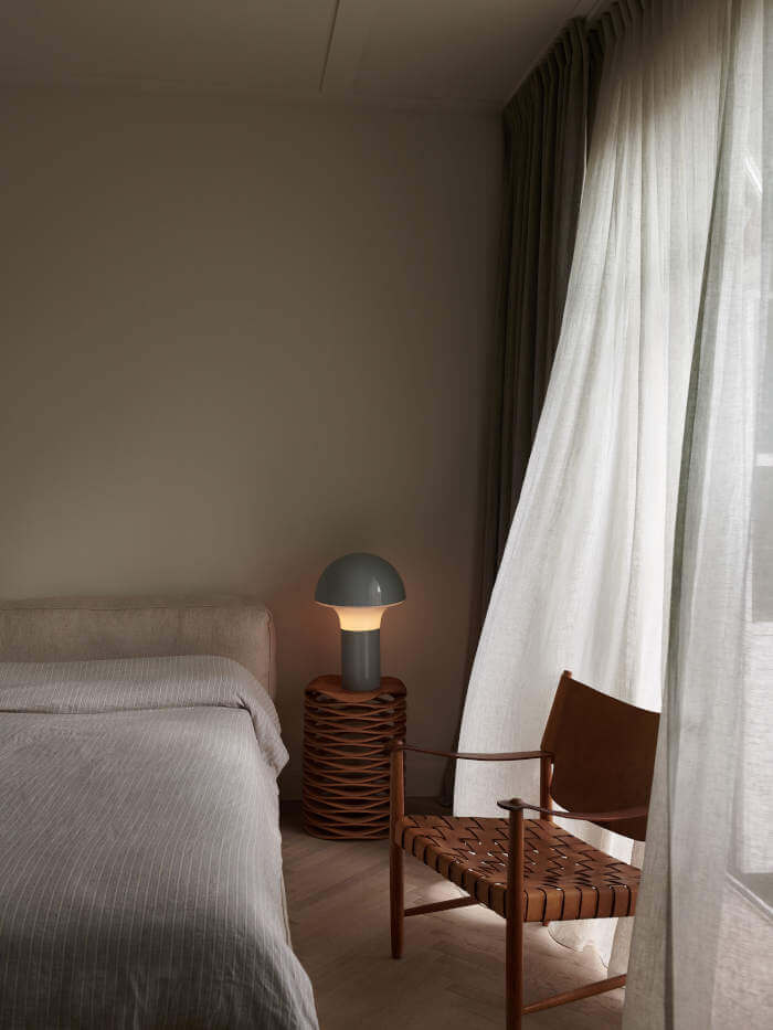
Some prefer a more simple sort of design for area like the bedroom, something that’s soothing and relaxing. With that in mind, check out this beautiful bedroom designed by Isabelle Stanislas. It has a monochrome palette based on light and soft neutrals and what really stands out is the use of natural and organic materials, textures and finishes.
Peaceful neutrals
It might just be the perfect time for a makeover in which case these will come in very handy or could just gather some inspiration for the future. We’re covering a variety of different styles, color palettes and bed types so there’s something here for everyone.
The bedroom is one of the rooms best suited for a more retro design because usually these details add warmth to the space around them and make the area feel cozy and welcoming. Such a design was chosen by Sasha Bikoff for this beautiful bedroom inside a New York apartment. It’s an eclectic design with stylish Hollywood-inspired details, classical and mid-century modern accents.
Modern with weathered accents


Beauty in the details
Originality is always important and when designing or decorating a bedroom that can be translated into various decorations and details that reflect one’s own unique style. For instance, you can add framed artwork or pictures up on the walls, decorate with plants or add an interesting headboard to serve as a focal point. This bedroom designed by Nickey + Kehoe is quite eclectic and can give you plenty of ideas regarding this strategy.

A mid-century update with a modern twist
It can be difficult to find the right balance in a design that involves lots of different colors, textures and patterns, even more so when the room is small. This lovely bedroom designed by Peter Dunham is a wonderful source of inspiration in this sense. Even though there’s a lot going on here, it all looks and feels harmonious.
For some, a modern bedroom can come across as just a bit too clean and with not enough charm. By adding a few vintage decorations or furniture accents or something as simple as a wooden beam across the ceiling with a weathered look the balance can be restored. That’s just what makes this particular bedroom designed by Handelsmann + Khaw so charming and interesting in the first place.
A cozy bedroom with quirky accents
This lovely Parisian apartment definitely has a lot of charm and the bedroom in particular looks very chic. It features a nice mix of minimalist modern furniture and retro accent pieces and decorations. Its walls are also filled with artwork for an added touch of color and an artistic vibe that really suits this whole place.
It’s nice to base the design of a room on the base features that make it special. For example, this bedroom designed by Katie Martinez has a wall of windows which is beautifully decorated by light and patterned curtains. The room as a whole looks and feels very breezy, relaxing and inviting and that’s partially thanks to all the natural sunlight and the openness of the decor.
Minimalism infused with boho accents
Another one of our favorite bedrooms was designed by Trilbey Gordon and has a pretty simple and plain look, at least at first sight. However, the more you look at it the more you realize it’s actually not simple or bland, it’s actually filled with all sorts of details. The color palette itself is a lovely blend of neutrals with pale green accents. The overall design is sophisticated and elegant.
Dark colors can also look amazing in bedrooms. In fact, some designers prefer them. A lovely example in this gorgeous bedroom by Tali Roth Interior Design which plays with contrasting nuances like white and dark blue. This gives the space a clean and chic appearance and also highlights certain elements and allows others to blend in more easily.
Vintage meets modern


This is actually one of the bedrooms inside the Trematon Castle which was built in the 14th century, as you might be able to tell by how busy the design is. The color palette is quite unified but there are a lot of different patterns that distract the eye and don’t really allow it to focus on one thing in particular.